
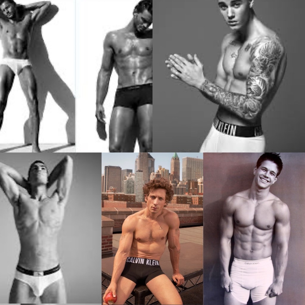
The most iconic images in the men’s underwear market are so often focussed on a monochromatic item of underwear. When you picture Calvin Klein for example, I am sure one of the below images comes to mind! Black, white or grey seem to be the lifestyle that brands want to sell.
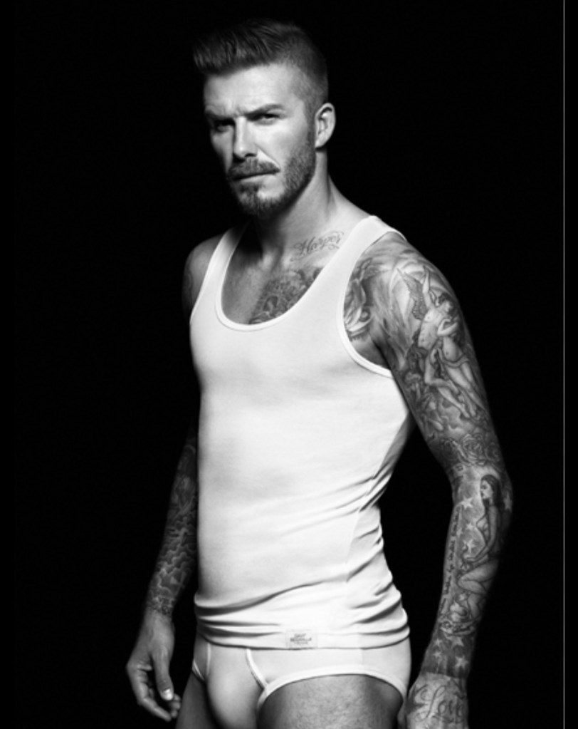
Then there was David Beckham’s range for H&M which ventured out of the colour palette, but still maintained the single colour in the main marketing for the range.
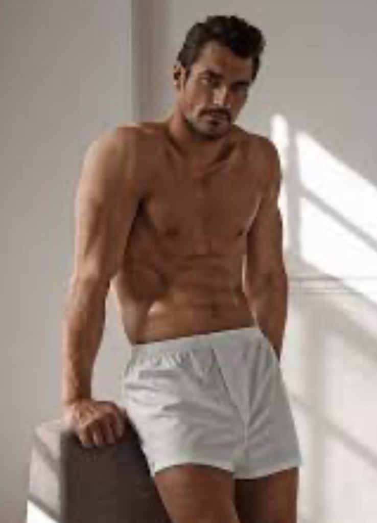
The other David, Mr Gandy himself had a range for M&S which again was predominantly monochromatic, but the limited colour range did have a couple of special colours too, that you didn’t see other brands doing.
But interestingly, as Iconic as these brands, collections and the men behind them are, I get the most engagement with the underwear that features patterns, colours and bold statement designs. So why is it that brands are hesitant to build a collection on a strong statement?
I suspect it has to do with hitting the masses and not being exclusionary to any particular group, however I wanted to create this post to celebrate some of my favourite underwear in my collection that feature the fun! Afterall, what I always say is that underwear first and foremost should be about feeling good in it!
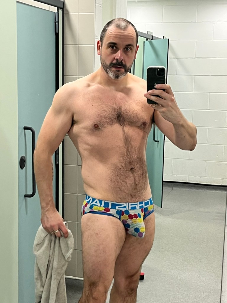
These Andrew Christian briefs feature a breathable mesh fabric and a front panel that cups under your bulge and gives it a little lift and push forwards.
The design is a cacophony of colours in a geometric hexagonal tessellation and to me is a celebration! A good waistband that has stood the test of time as well. The fit is great for the active man and the mesh gives some wriggle room whilst you are on the go. For me these briefs are a joy and I feel amazing in them.
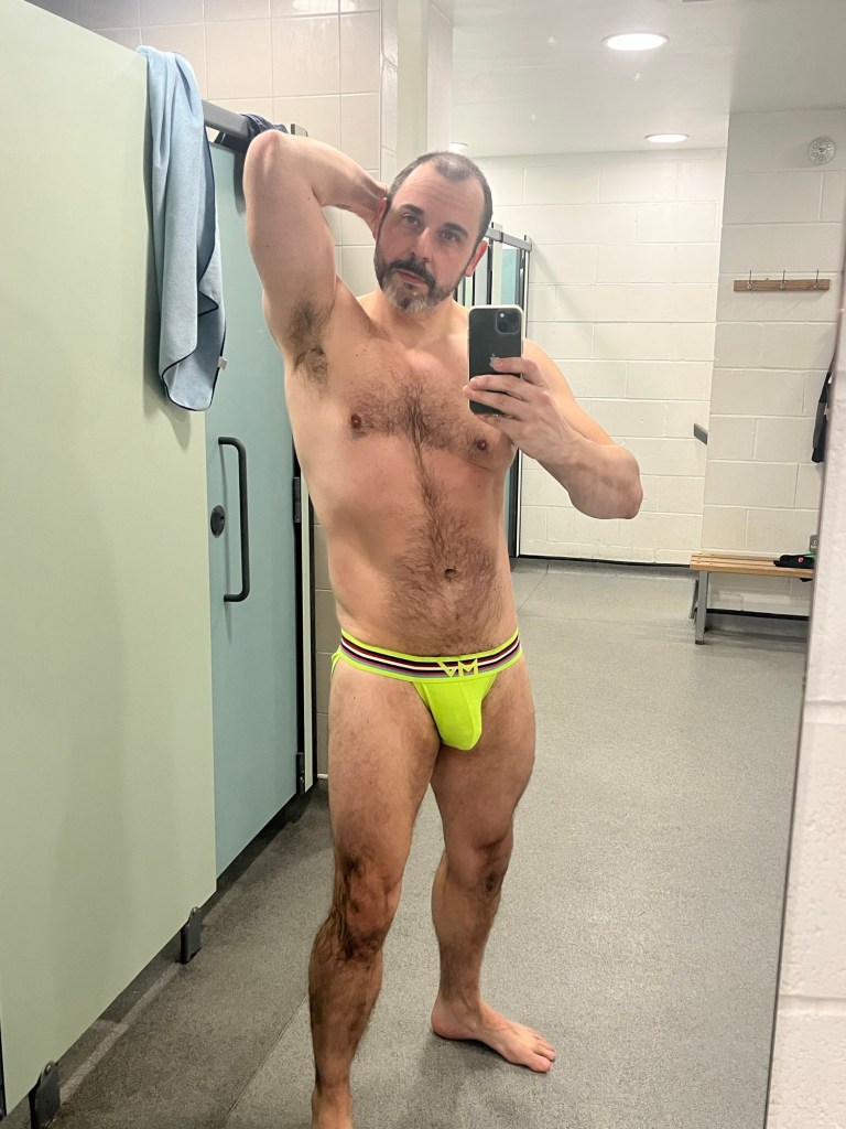
Neon yellow by Modus Vivendi. It’s a tanga cut in a slightly ribbed fabric which offers stretch around the male contours. The fit is impeccable. A full back which covers the whole cheeks, and the fabric is so soft and comfortable to wear. But let’s face it, the statement is in the colour! Bold and in your face, the neon yellow pops in all skin tones.
The waistband has some contrasting lines of colour which actually act to slim the waist down and make a feature of the MV branding.
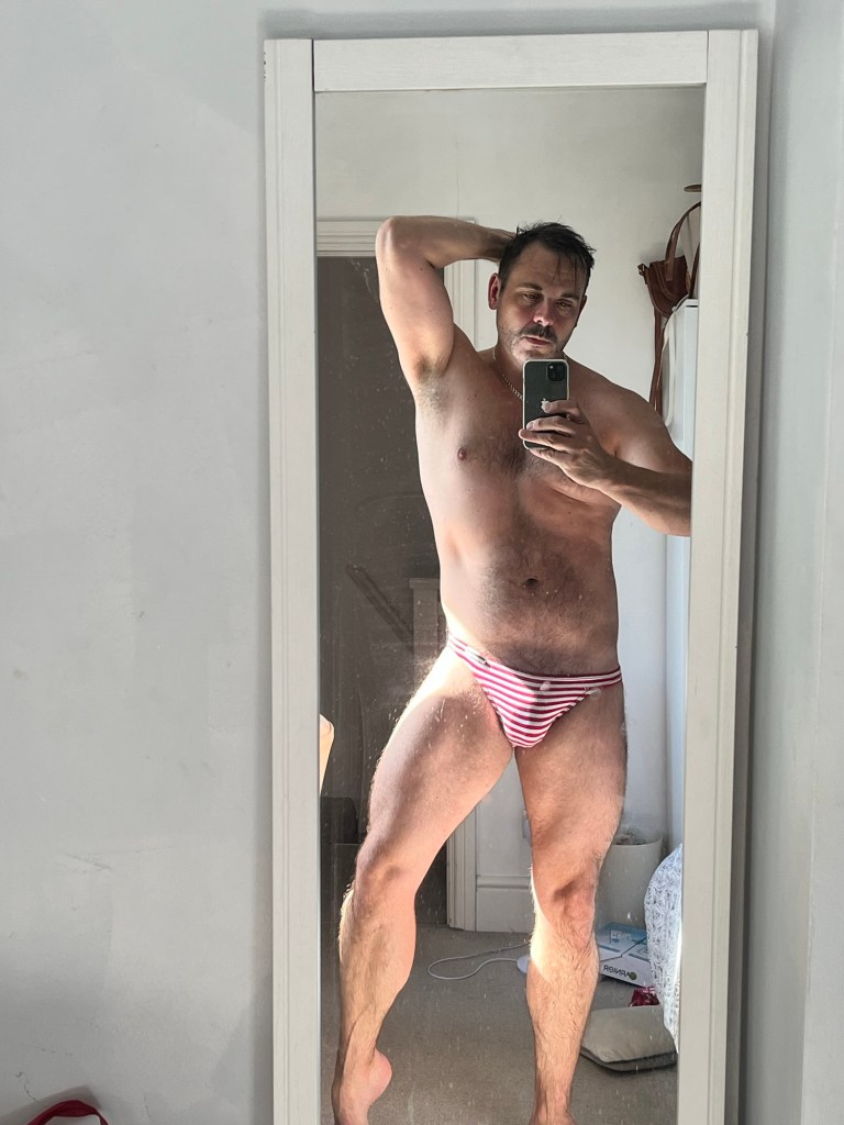
Probably the pair that I get the most comments on are this striped pair by TOF. A very simple stretchy design which utilises the horizontal stripes in red and white to create a streamlined aesthetic and a natural contour. Not the most “out there” design, but the little details make these super chic and a flattering narrow cut which suits the whole plethora of body sizes. This is a really clever use of pattern creating a super flattering shape.
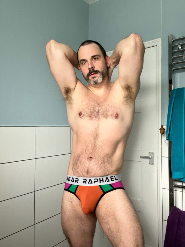
I couldn’t write this post without featuring the Wear Raphael colour blocked brief, which to my mind has the most interesting colour combo, in plain panels.
The pink/purple into the green, and the contrasting black piping, work to draw the eye forward into the super stretchy orange panel at the front! It’s a clever use of colour that maximises the impact of the briefs and leaves me feeling at my very best. Factor in how super soft the fabric is and the fuller cut, and comfort is also at the forefront of the design.
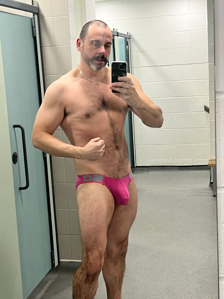
And finally for this post is an unbranded pair of briefs. The bright fuscia colour is contrasted on thick elastic side panels with a turquoise detail, which is a popping colour combination. The pair is designed with the same curved line around the front panels. It is sexy and the clean lines which reflect each other make this design super wearable. Again they feature a ribbed fabric which offers support and stretch and for around £6 you could do a whole lot worse!!!
So there are a small selection of briefs from my collection that bring a bit of brightness and pattern, to a monochrome world! Let me know what you think in the comments
TIB
